Friday, December 18, 2009

Winged Arch

Of course, this runs right in line with my obsession on butterflies and reliquaries...nice work by Damian Hurst...who at times I think is too trendy, this work is subtle and beautiful...lost in the patterns and decorative qualities, this work has a rhythm...it breaths and beats like a body...the eye moves around the picture plane in an even way...this is because of the symmetry in the design...the balance and centrality create calm in the viewer.

The context is stained glass and cathedral, the pinched oval and arch...a perfect union of the present and the past...I had a chance to see other works like this at Art Basel, Miami...they were just as powerful up close. The sense of organization and arrangement is meticulous and profound...creative and expressive...any amazing work of art.

Thursday, December 17, 2009

Organic Rhythms

Organic cut paper work and drawing provide an organic feel that is rich and decorative...the line work is expressive and mimics the flow of the paper...The blacks, whites and grays carry the eye around the picture plane...interest occurs in the value variation, mark making and small spots of color...yellow and orange...in the context of the very neutral palette, these areas of color provide a nice visual surprise.

The format is also slightly unusual, it is an extended rectangle, not in the golden proportions but pushed out beyond, more in the context of a landscape...the layers provide a low relief space, encased in a shallow, but three-dimensional space...these works allow for movement when picked up...and show a level of visual and literal fragility...delicate and beautiful works by Judy Pfaff.

Wednesday, December 16, 2009

Commercially charged

The illusion of a commercial object in a traditional medium, paint and wood, layered with another contemporary issue...this contained commodity context provides an obsessive look into our desires for things...complete with an aged and dirty box.

The central image, sonic boy, is in a cool color scheme, contrasting the warm box color...a focal point nicely blended into the box context...the scale of these pieces are slightly smaller, creating intimacy and forcing the viewer to come into Dan Douke's world...beautifully painted and creatively combined...these pieces move one commercial context into another.

Tuesday, December 15, 2009

I see inside you

Building on traditional glass forms, this work by Washington DC artist Tim Tate, moves the medium in alternative directions...a play on interior verses exterior...contained and precious this piece utilizes color (black/yellow) and moving video to move the viewer from the outside to the inside. There is a sense of confinement as a participant, you feel like you go inside the jar and reside there for the experience...depending on how engrossed we are in the video, it can provide a virtual claustrophobic experience.

Like the ship in the bottle, we wonder, how did this all happen? The video portion can happen with sound or without...the scaled down electronic components are visually in the background to the simple bluish, translucent moving images...he has a mastery of material and builds on formal and historical relationships to create a world that is simple and new.

Monday, December 14, 2009

When animals attack

Something primitive is being explored, an open mouth and showing teeth...aggressive actions occurring all over the picture plane...a shallow space is explored in this piece by Aaron Johnson...A blue backdrop moves the eye around the piece...pinks, greens, oranges and reds combine in high chroma with intensity, alluding to Asian tattooing...

Strong complimentary color scheme and large scale of the hippopotamus' open mouth is the central image, a focal point, moving the eye up and to the right across the tiger and around the head to the left and down to the left and over to the bottom right...The vibrations of the active figures, leaving the viewer with a sense of unease and intensity.

Friday, December 11, 2009

The air between

I first saw works by Jacob Hashimoto a couple of years ago at Art Basel, Miami...I was enthralled by his precision in execution and the overall decorative qualities of these multiple circles, pentagons and octagons...this layering of paper covering light wood armatures...it reminded me of thousands of floating kites, gently hovering above the earth....

The way they combine is visually interesting and complex, because of the relationships set up by their proximity...like the works of Seurat, dots of pigment separately convey one idea visually, but put a green dot next to a red and see the vibration...optically, colors together react in our brain, attempting to unify...this work is about shallow space, relationships between tint, tone and hues and organization...a symphony of expression...most beautiful...

Thursday, December 10, 2009

The effects of imagination

Angularity and moving lines make this photograph by Julie Blackmon a very interesting image...the eye moving across all the angles, along the floor, up the back of the chair and over to the off kilter portrait down the window to the radiator, on to the cushions and back again.

The boy and his reaction to his environment adds a interesting conceptual dimension to the image...reinforcing the scattered nature of the room...hyper and out of control, the image and the emotion of the photograph...these are the remains of his efforts, how children change their environment when they are in their imagination.

Wednesday, December 9, 2009

Master and servant

Natural mythology...narrative and reality meet in an odd sadistic world...animals take on human characteristics, cruelty and dominance the genus and species are all combined and recombined, the most appealing visual and textural components have been genetically extracted, connected and contained into these museum quality sculptures.

They feel so real, Enrique Gomez de Molina has done an amazing job not only assembling seamless animal forms but he adds to the narrative by chaining another pet/servant insect to its wrist...the posture and attitude is not of a caged animal but of a dominant, free range master, controlling with purpose its slave. These forms act as metaphors, carrying the great burdens of our human existence.

Tuesday, December 8, 2009

Circular textures

Found objects, recombined in a decorative way, referring back to Baroque and Gothic imagery...I am always attracted to decorative....maybe we are like birds looking for sparkly bobbles to bring to our nest...we are visually seduced by the colors, textures and sheen...this piece by Alfonso Ossorio utilizes repetition in color and shape to move the eye around the picture plane.

Artists visually calm the eye in this sea of activity through strong symmetry and larger areas of monochromatic color usage...they eye needs areas to relax otherwise it becomes overwhelming...it negates the beauty and decorative qualities and just confuses the mind. The circular forms are repeated and carry the eye over the circular picture plane.

Thursday, December 3, 2009

Taking a stand


Another nice image/poster by Shepard Fairey...the pixil-ated surface is commercial in nature because of digital imagery and reproduction, what separates these images, in my mind are the simple details...elements that move slightly away from the glitz...the off white backdrop, instead of the clean and sterile white margins...the loss of visual information, it is not necessary to complete the image in a glossy way (in line with Warhol's silk screen portraits) and the over spray and looseness of the exterior line quality...these visual suggestions tie back to street art.
He does a good job of making the noncommercial, commercial which I feel many creative individuals miss, DON'T compromise on the work to be more commercially viable, but utilize the marketing and commercial tools to take what you do and get it out there...it's a numbers game, if you want to be successful you have to knock on more doors and get your images out there...in this way Mr. Fairey is dominant in the market place.

Wednesday, December 2, 2009

Tranformation of a snap shot

In honor of my meeting with Shephard last night, I wanted to explore some of the reasons I enjoy his work...we talked briefly about the case pending with the Associated Press over this image and I have been thinking about the case for a while...art, as a discipline, generally does not prescribe to this notion of complete and utter ownership of an image...we realize it may be possible that nothing new has been created for a very long time and we re-present similar images and ideas over and over, but in a slight and subtle new way, incorporating the modern individual and her or his own experiences...nothing is entirely unique but everything is infinitely new...new to the artist and new to A viewer...this digestion process changes the parts and makes a new whole...

I won't get into the legalities of the situation but let's just look at what this image did the the AP image could not do...the structure may be similar, but with the color, divided background, the simplification of shape and line...these significant changes transformed a likeness into work of art that moved, empowered, motivated and changed our country. The other point I would like to make is that the AP had every opportunity and still does to sell the "original" likeness, yet no one wants to buy it, why? They are a big company with deeper pockets, more opportunity to market and sell this image, yet is still remains meaningless to most people. Is that what's really relevant here? It's a different image, it is a work of art and not just a snap shot...

Friday, November 27, 2009

Sad and conflicted

The figure is engulfed by line work, the "Weeping Nude" by Munch utilizes the visual medium to convey the idea...the darkness around the face combined with the fleshy, light areas on the arm and back counter balance the strong line created on the right hand side of the picture plane between the red and green.

The figure becomes the bridge that connects these visually opposite areas...the use of green in the figure further ties the picture plane together...all is in balance, but these visual devices embody the sorrow of the moment...we are voyeurs into a life, a sad and in conflict existence.

Thursday, November 26, 2009

Image and title

A strong commentary on relationships and personal, emotional tragedy...this piece by Edvard Munch entitled, "Vampire," attempts to conceptually close the space between image and title. It looks like a fairly normal embrace, the male figure is buried in the breast of the woman in a submissive pose and she appears to be kissing his neck, or is she sucking him emotionally dry?

There is always a darkness to Munch's work, an eerie, unexplained quality...an ambiguous, but active background....mark making, concentric line work around the figures, touches of color, but used visually to move the eye around, creating a sense of unity...without the title, would this be just an embrace?

Wednesday, November 25, 2009

In the moment

Enough said! The most famous and popularized Munch painting...he did several versions of the piece in different mediums...a very unique approach to an unsettling emotion at the time...a triangular compositions, moving from the main "screaming" figure, up the right and across the sky to the two figures on the left hand side and back down to the figure.

The line work and waves of paint/emotion carries the viewer around visually like directional arrows on a highway...a strong complimentary color scheme, blue and orange, balanced with brown/neutrals...creating visual vibration, parallel to those feelings during a scream.

Tuesday, November 24, 2009

Love and loss

This piece by Edvard Munch entitled, Separation II, is a beautiful exploration of longing and loss. The female form is facing away, looking out over the landscape her hair is merging with the striated background...blowing away in the dark environment.

The male form is contemplating the past, eyes closed and head tilted away from her...a dream of what was and what could have been...the decorative, rectilinear shape at the bottom of the picture plane tieing in with the reddish orange organic shapes below and to the left of his face...her hair is draped over his shoulder, part of him but separate.

Monday, November 23, 2009

Exploring Angst


Confronted by the darkness and angst, a series of exploration in Anxiety by Edvard Munch...the faces are expressionless but the organization of the individuals is random, asymmetrical, lost and standing waiting...suspended in time and water...

Contrast of color, strong complimentary color scheme...flowing and vibrating line work...capturing the dark and lucid moment in time...organic construction...I have also included the simplified print version to see how the composition is re-organized to fit the context, color and material concerns...Munch does an amazing job capturing the emotion of a point in time.

Friday, November 20, 2009

Religious contemplation

Madonna and child by Hans Memling, the Madonna is looking away from her son and the interaction...contemplating what she know is inevitable, the sacrifice...the baby in these religious works all look more man like than baby like...stylized, alluding to those Gothic religious icons but more naturalistic and realistic.

These works almost always have feet and feet of fabric, showing the artists' expertise on folds...these kinds of works play with interior verses exterior space, showing an extended landscape...Hans Memling's female faces contain a lot of emotion, they speak to the complexity of the situation.

Thursday, November 19, 2009

Ample digestion

Pen and ink drawing by Massimo Guerrera...the triumvirate meeting of the minds in a triangular format and the repetition of the head form...looking left, looking right, looking down and an additional head-like form sitting precariously at the top of the picture plane...the activity at the left, the saucer, crumbs and cup push the eye over into the asymmetrical composition and up into the wall...back into the tallest, standing figure and around the three heads again...

Subtle line work and mark making set this drawing apart, stippling or splatter work adds to the movement of the piece, helping to guide the eye around the picture plane..the mouths lapping visual information in and digesting it out through the top of their heads like a blow hole on a whale...a smorgasbord of visual delights!

Wednesday, November 18, 2009

My safe place


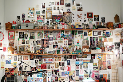
Something a little different...this is a studio installation I did for a show summer 2008...it was a very liberating experience to replicate my studio environment for viewers...it is an intimate space that I live in and create, surrounded by the congestion of beautiful and challenging images...I want to be constantly confronted by creative works.

There are some days when I am out of gas or blocked and I go to my studio and just stare at the wall, it motivates me and pushes me to be better...I have to be work harder because I want more creatively...this piece is also about organization, the relationship between artists and their works next to one another...how they connect and visually react to the viewer and the world around us...


Tuesday, November 17, 2009

Parallel leanings

Beautiful altarpiece by Flemish artist Rogier van der Weyden...Flemish artists were ahead of their time...the Italians were known for the high art of the Renaissance, but ten to twenty years prior, the Dutch were creating masterpieces of realism injected with great emotion...

This piece formally refers to the parallel emotional plight between Jesus and Mary, both in the same basic leaning pose...arms almost touching...Jesus traditionally splits the canvas in symmetry...he is the focus and lord God as prescribed by the donor...the gaze of those attending are very important in religious works, they act like visual lasers, forcing the viewer around the picture plane, we want to see what each character sees in the narrative.

Monday, November 16, 2009

Bright white light

I really enjoy when artist push the limits on asymmetry and balance, teetering close to the edge of visual destruction! This photograph by Kate Peets certainly plays in that arena...So much of the piece is monochromatic and fading, loosing the boundaries between foreground and background, figure and open space...

The dark space between the lips and the eyes balance all of the creamy flesh and wall, the expression and pose add a conceptual depth that moves the piece beyond the formal...I can't help but wonder if the pupils have been digitally enhanced, they seem too square for the pose and position, regardless, artists are liars and proud of it! "Art is the lie that makes us realize the truth."

Friday, November 13, 2009

Her stillness

Beautiful striations juxtaposed against the smooth texture of a nude female form...the light swept motion of the water to the right of the figure and the shape created by the lightest lights against the darkest darks...in combination with the glance to the right, how much activity and form must be on the left to counter that extreme value contrast?

In this photograph by Sally Mann we see the weight required to move the eye over and reconcile the asymmetry to put all in visual balance...the figures legs and torso are off from the center with the dark left side visually forcing the eye away from the lower right corner, to the hands, up the left side, around the head and back again...but what is most seductive, those gentle wisps of value, liquid and out of focus moving all around the stillness of her.

Thursday, November 12, 2009

The organic possibility


The kinetic possibility of this image by P. Pott Scarsons...visually the potential of this falling tree limb, the parts and referencing whole trees in the bottom...the figure in the lower right, moving away from the approaching organic shape...but there is something beautiful about the bright sun and the black, sharp edged tree.

Balance between the open white and gray sky against the black topscape at the bottom of the picture plane...the angle of the falling tree, pushing the eye to the right and connecting to that running figure, contrasting visually, the tops of the trees that are straight up and countered by the lightest shape in the sky...moving and balanced asymmetry.

Tuesday, November 10, 2009

Cloudy with a chance of evil

Those artists that choose to utilize the frame as part of the piece should take a formal lesson from this work by Jeremy Fish...Beyond the conceptual connection between the head with the open mouth showing us a vignette inside, those billowy, cloud shapes in the hair around the mouth tie in nicely with those same cloud forms in the foreground of the painting.

I also really like the visual of an animal, in a very direct way, using garbage as a tool...implying a level of competence and evolution...they may not be the intention, but the piece allows for a significant amount of the reading into it...these stylized, monochromatic, painted images play in harmony with the frame, the contrast comes in the concept, calm, serene and at the same time sinister and dark.

Monday, November 9, 2009

Electrified environment

Disorienting work by Scott Anderson, this piece plays on our natural instinct to upright elements...especially the human form...segmented into different zones, lines and shapes cross and flow through the sections to tie the zones together....

The piece moves quickly due to the strong vertical lines contrasting against the large human figure horizontal and other shapes in space...the feeling is of a futuristic landscape, an environment that has yet to be defined...we as the viewer attempt to conclude an outcome, with minimal clues...there are other figures in the space at a smaller scale, leading the eye back into this world, they are key in extending the environment and visually making us feel that there is more to see behind the central figure.

Friday, November 6, 2009

Hiroshige, flowing in swirls

Another amazing piece by printmaker Hiroshige...the lines created by the concentric circles, the flow of the water and white caps...a formal exercise in creating line work that is interesting by contrasting sizes and shapes...the spaces between the white caps vary, creating interest and the scale of the white caps in the swirl...larger and in higher concentration than the rest of the picture plane...the unique shape and line work make it a point of interest.

The rectangular picture plane is broken into zones, top zone is sky with finger like shapes, the white clouds mimic the shape of the white wave tops...carrying the viewer into zone two, the rock break, jutting up into the sky at their highest point and gradually scaling down into the ocean...the final zone, whirlpool references elements of color and line in the other two zones, creating a tight and cohesive, complete piece of beauty.

Thursday, November 5, 2009

Hiroshige verses Van Gogh

There is an amazing collection of Japanese copies at the Van Gogh Museum in Amsterdam...This is a good example of one of Van Gogh's copies of a Hiroshige print...Color is a little off, but I found the prints the perfect combination of the Japanese simplicity with the thick and meaty painting style of Van Gogh.

The centralized, tree image breaks the front picture plane and is not only prominent in scale, it is also dominant in value and scope. It breaks the picture plane up into unique, separate windows...showing us a visual narrative in the spaces between branches, flowers and tree trunk. A beautiful composition, flowing and organic.

Wednesday, November 4, 2009

Hiroshige, the cold days

Capturing the essence of a winter...another beautiful and subtle print of Hiroshige...a process of articulating in pure value with only hints of color and neutrals...in these works, the signature stamp becomes part of the image, it must be balanced in order to have a complete image...the red at the top, in the obi of the woman carrying the bag and in the left corner, carrying the eye around.

The central blue figure, is secondary to the overall landscape...the human beings are only ornamentation to the grand qualities of the natural space...this fact is consistent in several Japanese prints...mythology and the cultural narrative are also visually articulated by specific artists.

Tuesday, November 3, 2009

Hiroshige, another day's close

The blue lines at the top and the bottom visually pinch the work and force the viewer in the middle of the picture plane...the orange glow of the horizon line happens at the one-third mark toward the bottom...strong vertical lines run the eye up the picture plane in the form of flower stems.

Green is the glue, running through the entire picture plane, tieing it all together visually...coming up from out of the surface and growing up outside the picture plane, the flowers, stems and leaves set the picture in place...enjoying the subtle atmosphere, being present in this exact moment between day and night.

Monday, November 2, 2009

Hiroshige No. 1

A beautiful print by Japanese printmaker Hiroshige...the white tops of the waves, swaying back and forth, becoming more intense and wild as they meet the foreground...contrasting the subtle and calm background...The marks of the dark blue rolling up the waves and articulating the shape of the wave...

The visual style of the print is built off of the seen, but abstracted in memory, naturalistic in approach but injected with emotion, to grab the viewer at the deepest level...the duality of the talon like wave and the tree limbs bookend the picture plane...pushing to the eye into the asymmetrical background, we want to see Mt. Fuji, but are view is impeded, unable to fully realize is majesty.

Friday, October 30, 2009

Armed in Gold

A really unique example of a reliquary, where the part of the Saint's body is created in gold and then stored...early conceptual abstraction, fusing two different ideas, visually, in the name of the greater conceptual good...

The arm bone is stored inside the arm and can be viewed through the lattice patterning...a beautiful piece, the hand is interestingly covered in jewels, not patterned but asymmetrical, reinforcing the abstract stance...the base functions not only as a visual ground, but a house of God, with it's most important relic rising out.

Thursday, October 29, 2009

Golden BEAUTY

Another beautiful reliquary...the gilded structure and the miniaturized context, alluding to something big and ritualistic...I can't help but wonder, which I have many times before, will we ever as a society, get behind something some magnificent and culturally relevant.

Have those things that cost so much and made such a mark on our creative consciousness been eliminated from our visual vernacular...I hope not, but I am loosing hope...

Wednesday, October 28, 2009

Quiet reliquary

A nice, simple zen like example of a reliquary by Novie Trump...this work in clay explores a focused look at a spiritual subject matter...the context is textured with expressive marks surrounding the recess where the scroll and egg form lie.

Neutral grays and tans dominate the piece, providing a timeless backdrop to conceptual contemplations...the shape references, reliquaries, monstrances and the familiar arch form in so many religious icons, but because of the abstraction, it whispers significance and doesn't have to beat you over the head with it's presence. I appreciate the tone of the piece and its effective use of minimal, visual expression.

Tuesday, October 27, 2009

Interesting cast of characters


Nice collage based environment by Alexis Mackenzie, built off of a natural context, this work moves us visually and conceptually into a unique world of unexplored relationships, the organic, the mythological, the unreasonable and the absurd...

The symbols are clean and graphical in representation...the overall appearance and consistency in how each image is rendered allows us to visually group the individual elements and consider the piece a whole...the space between the images is also considered and interesting, playing with negative space in a simplistic way.

Monday, October 26, 2009

These boxes contain many things!


I have been fascinated for a long time by these beautiful objects...Japanese Inro first caught my eye in the Field Museum of Chicago...there was a show of several of these objects. Decorative objects have always intrigued me, they formally are sound, using the language of sculpture to convey ideas and carry, in this case, a narrative message...discussing historical details, or mythical beasts...the parts are meant to "fit" together, both literally and metaphorically...each part referencing the story existing in the body of the form.

In my own work, I think about the notion of function, the idea of participating with art is very exciting and on some level, insidious...tieing parts of society closer through touching and feeling art...I believe the separation, artists and galleries sometimes promote, only alienates the public from those creative instincts...it makes the "non-artist" feel they could never do those kinds of works, thus negating an essential and vital part of their inner being.

Friday, October 23, 2009

Four legs on the floor

Leg to leg , back to back...those things focused on are obsessively sexual...the mirror is another opportunity to see the reflection of that obsession...layered intensity...visually, the placement of the feet and legs are angled and asymmetrical, contrasting the organic, voluptuous nature of the individual body segments.

We connect the parts to make a whole individual, continually trying to reconcile the un-balanced and a figure that is incomplete...The introduction of some clothing elements moves the abstract into form into reality, further blurring the line between visual worlds...there is also something dark in Hans Bellmer's work, the environment and forms are aged and not commercial.

Thursday, October 22, 2009

Dress in figures

More flowing lines and concentrated areas of line work, focusing the eye around the picture plane...the female form is explored again in segments...wood planks add an element of contrast, geometric lines moving back in space, running under the organic line work.

Varied texture and movement carries the viewer around the space...grounded by the active line work in the lower section of the drawing, this activity is count-balanced by the open white areas in the upper half of the rectangle...The line work is sensual, the dress follows her form and moves beyond the illustrative to the beautiful.

Wednesday, October 21, 2009

Negative masculine influence

A bent and broken female form, damaged...fallen and integrated into the contrasting geometry of a chair...the human parts are a departure from the illustrative, they move beyond into the visual world. Hans Bellmer makes an effort to enhance the form for expressive purposes..

This piece pushes the contrasting elements, those flowing organic female components are now combined with man made parts...a possible commentary on the imposition of the masculine and how it negatively influences the way this women could function in the plastic world.

Tuesday, October 20, 2009

Dark openings

A strange sexual world Hans Bellmer explores in his drawings...an amazing drafts person, he pushes the limits of the obscene, seducing the viewer with beautiful drawings and dark, hidden subject matters...

Similar to the doll like female forms, the drawing is made up of parts, unified in an unusual and provocative way, the composition is asymmetrical and flows organically from the foreground to the background, between the three eyes...at first glance it seems that the female face's eye is damaged, looking at it again, the viewer notices something more explicit...possibly playing off of the idea that eyes are the windows to the soul, the opening becomes a window to something pleasurable and uncontrollable.

Monday, October 19, 2009

Her face was like a doll's

An exploration of the female form and those things flowing and organic...the work of Hans Bellmer is unique and influential to many contemporary artists...the photographer, Cindy Sherman as an example...the doll like forms have an odd feel to them, an search for something sexual and explicit..the parts are incomplete and partially dressed, amplifying the feeling of the indecent.

His works have minimal color, focusing on the relationship between the organic shape and its contrast to the hard surface of the ground...the neck is incidental, the head is fallen and bent into her chest, a mask, a surface, a lost soul...the limbs do not combine naturally, they lay on top of one another or they crowd, tightly, providing a visual sense of claustrophobia.

Friday, October 16, 2009

Repetiition and repose

It's all in the placement...Philip Pearlstein has made his life work an exploration on the figure, but the environment is what really matters in his work...often the central form seems secondary to the activity in the background...a balance between the monochromatic female form and the intense color and pattern of the rugs, wallpaper and props.

Also essential is the cropping of the figure, there is a feeling of incompleteness, the head cut right above the mouth...the face removed from consideration so we concentrate on the figure as object...in this work there is also the repetition of the leg in the drawing, mirrored in pose to the more complete painted central character.

Thursday, October 15, 2009

Nature verses Wo(man)

Amy Stein takes on the issue of environment and the human population encroaching on animal territory...this piece is a great dialogue between wo(man) and bear...standing very still...eye to eye...

The balanced composition between the blues of the pool and bathing suite in contrast to the large black form of the standing bear...the fence separating the two, provides visual separation...the kinetic potential of the bears power to break through and attack...a western stand off, strong visual verticals contrast horizontals in the fence, house and diving board.

Wednesday, October 14, 2009

Not THE wooden arc

Wooden masterpieces inspired by movies and contemporary culture...this Arc of the covenant is done by Mike Rea...a copy of the original Arc from the popular, Indiana Jones movie is brought to life.

Humor and whimsy play a large role in the works, pushing what we think that can be done through wood as a material...some of his works are large scale, others are incredibly detailed...in this work the pattern and the repetitive elements create a visually stimulating piece...we take in the full context, the smoke and lights enhance the drama of the out of place, wood media.

Tuesday, October 13, 2009

Love you, lips

I really love jewelry by Salvador Dali, this Ruby Lips brooch is a great example of an innovative piece in its time of creation...formally, the flow of the lips, asymmetrical with blood red in rubies...teeth of pearls, not lined up, not natural, but visually better than the "norm."

The way the gems are set, the gold prong settings move they eye all around...a decadent exploration of a simple image...before Damien Hirst created his diamond encrusted skull, Dali created several pieces of beauty and challenging design.

Monday, October 12, 2009

Designed upside down

The way Lennard Schuurmans using space here is very appealing visually...it has a narrative feel, elements, representational and decorative/abstract are combined to create the foreground...the background is open and stained with marks...this unusual landscape plays with objective, understood forms - animals, plywood and nails, turning these ideas metaphorically and literally upside down to trick us visually.

The piece stretches our imagination of landscape...we are easily deceived because we have been trained to believe what we see as fact...artists can play with us, most are immature and naive to what visual language really means...but you cannot blame the student for what the teacher cannot explain...the design is colorful and has movement and contrast...the flowing of the water up into the picture plane, the cracks in the ground and the rolling of the pink amoeba...well crafted formally.

Friday, October 9, 2009

Balanced values

Balance and asymmetry...breaking the centrality of religious works...how much space on the right is necessary to counter-balance the activity and figure on the left? And that sharp contrast edge created by the dark jacket against the white wall...how much gray is needed to counter that weight/volume?

Mapplethorpe shows us how much in the amazing portrait, not only a visually appealing piece, but an image that captures Andy Warhol as a artist and man of extremes...the obsession with fame and attention juxtaposed next to his social awkwardness...needing something so badly, but unable to see it fully realized.

Thursday, October 8, 2009

Relective organism

The mirrored surface of the Cloud Gate by Anish Kapoor, is neither black nor white, but absorbs, distorts and reflects the world around it...this piece is really impressive in scale and conceptualization...I am originally from Chicago and have gone back to see it again and again...I cannot get enough of its flowing shape.

The original form was to show the welds in a grid like form, later, it was thought that grinding and buffing out the lines would be more impressive...this was most definitely the case in my opinion! It remove the internal contrast between surface geometry and an external organic shape...The surface now takes on the geometries of the buildings and skyscrapers of the Magnificent Mile...A clean and simple design that is truly a masterpiece.